Strip away every indicator on a serious trader's chart and what's left is almost always just price reacting to the same handful of levels.
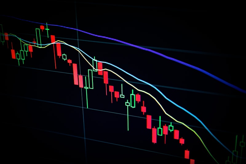
Walk into any professional trading desk at a bank or hedge fund, and you will see remarkably clean charts. You will not find charts crowded with MACD histograms, stochastic oscillators, or rainbow-colored indicators. Instead, you will see clean price action and a few horizontal lines. These lines represent support and resistance. While retail traders spend years searching for the "magic indicator" that will solve their trading, professionals understand that price is the only leading indicator.
Every technical indicator is simply a mathematical derivative of historical price and volume, meaning they are lagging indicators by design. Support and resistance levels are different. They identify the physical zones on a chart where buyers and sellers have historically committed capital, making them the closest thing to a leading indicator a retail trader can access.
This is educational content, not financial advice. Tax and regulatory treatment can change — always check current HMRC/FCA guidance before acting.
Why most indicators are S/R in disguise
If you look closely at how popular indicators are constructed, you will realize they are simply support and resistance levels dressed up in complex formulas.
Take the 200-period Simple Moving Average (SMA). Retail traders buy when the price bounces off the 200 SMA because they believe the average has mathematical power. In reality, the 200 SMA acts as support because thousands of algorithms and retail traders expect it to, turning it into a self-fulfilling support level.
Similarly, Fibonacci retracement levels (like the 61.8% level) are highly popular. The market does not reverse at 61.8% because of the golden ratio; it reverses because that level frequently aligns with prior market structure—recent swing highs, swing lows, or consolidation blocks. Pivot points are another classic example; they are simply mathematical averages of yesterday’s high, low, and close, providing a calculated guess at where support and resistance zones will lie today.
When you delete these indicators and focus entirely on the horizontal levels where the market has historically reversed, you remove the lag. You trade the source data rather than the derivative.
How to draw a level that means something
The biggest issue retail traders face is that they draw too many lines. If you draw a line at every minor pullback on the 5-minute chart, your screen will be a chaotic grid of noise.
To draw horizontal levels that carry genuine weight, you must follow three strict criteria:
- Prior Swings: Look for obvious "swing highs" and "swing lows" where the price violently reversed in the past. The sharper the reversal, the more institutional orders were sitting at that level, and the more likely it will hold in the future.
- Zones, Not Lines: Never draw a support or resistance level as a single, exact price point. If you draw a line at exactly $1.2500, you will constantly be stopped out when the price wicks to $1.2492 and reverses. Price is driven by orders that are distributed across a buffer zone. Always draw your levels as rectangular bands, typically 10 to 30 pips wide.
- Ignore the Noise: A level that is drawn through the middle of consolidation ranges or requires you to squint is a bad level. If a support zone is not immediately obvious to you within three seconds of looking at a daily chart, delete it.
Flip zones
The highest-probability setup on any chart is the "role reversal" of a level, commonly known as a flip zone.
When the market approaches a major resistance level, sellers push the price down. If the buyers finally break through that resistance, the market structure shifts. The traders who shorted the market at resistance are now trapped in losing positions. When the price pulls back to the broken level, these short-sellers quickly close their positions (which requires buying to cover), while breakout buyers add to their positions.
This convergence of buying pressure turns the prior resistance zone into a new support zone. Trading the retest of a flip zone allows you to enter a trade with a defined, logical location for your stop-loss (directly below the new support zone), providing an asymmetric risk-to-reward ratio.
Multi-timeframe confluence
A common trap for retail traders is drawing support levels on the 15-minute chart and expecting them to hold when a daily trend is underway.
In trading, higher timeframes rule the market. A support level on the Daily chart represents the decisions of central banks, hedge funds, and major commercial institutions. A support level on the 15-minute chart represents minor intraday algorithmic adjustments.
To maximize your win rate, you should draw your major support and resistance zones on the Daily and 4-Hour charts. Once these zones are marked, you drop down to the 1-Hour or 15-Minute chart to execute your entries. When a 15-minute entry setup aligns perfectly with a Daily support zone, you have multi-timeframe confluence. You are trading a low-risk entry with the backing of daily institutional order flow.
"
Strip away the indicators. Prior swing highs and psychological round numbers are where institutional orders reside.
"The fakeout problem
The most frustrating experience for a retail trader is buying a breakout above resistance, only for the candle to wick through the level, reverse, and trigger their stop-loss. This is a fakeout (or a liquidity sweep).
Institutions understand that retail traders place their buy-stops directly above resistance. To trigger these orders and generate the liquidity they need to short the market, institutions will temporarily push the price above resistance.
To filter out fakeouts, you must use close-based confirmation:
- Wait for the Close: Never enter a breakout on a live candle. Wait for the candlestick to close on the timeframe you are trading. If the candle closes above the resistance level, the breakout is confirmed. If it closes as a long wick below the level, it was a fakeout.
- Track Volume: A genuine breakout should be accompanied by above-average volume, showing institutional participation. A breakout on low volume is highly likely to fail.
Never chase a breakout candle. If the breakout is real, the price will eventually pull back to retest the flip zone, giving you a safe, structured entry.
Standardize your chart analysis and learn how to map structural levels in our Chart Reader Course. To scan multiple markets for major Daily and 4-Hour support/resistance touches, use our AI Market Scanner. If you want to understand how other indicators approximate S/R zones, read our guide on The Only Three Indicators You Need.